9
Scroll-driven scenes
0% — loading frames
Product design & front-end engineering
A commerce landing page for next-gen gadgets. Brand, design system, motion, and every component on the page. Scroll to fly into the build.
I'm a front-end engineer who works from the first artboard to the last deploy. Nexora is my most complete build: a gadget commerce landing page where I owned the brand, the design tokens, the component library, and the scroll choreography you just scrubbed through.
Learn more about me9
Scroll-driven scenes
26
Reusable components
300
Frames of choreography
0
UI libraries used
Typography
Nothing else on the page is set above 40px. The headline gets the whole size range to itself.
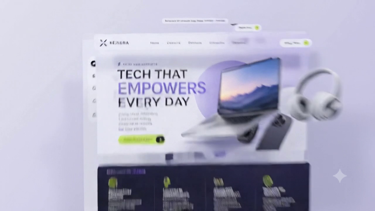
The headline runs clamp(42px, 6.4vw, 82px), so it grows with the viewport instead of jumping at 768 and 1024.
Letter-spacing drops to -3.5% at the top of the ramp, which closes the gaps the big sizes open up.
EMPOWERS is violet. The other two lines stay near-black, which keeps the count at one accent per screen.
The rendering layer
The exploded view on screen is four components on four transforms. This is what puts them there.
Every route is a server component by default. Only the scroll canvas and the carousel opt into the client, so the landing page ships about 40KB of JavaScript instead of the whole app.
The exploded view is one component taking an array of layers and a scroll value. It reads scroll through useSyncExternalStore once per frame, so four panels move on one listener.
One Product type is shared by the card, the grid and the detail page. Renaming a field breaks the build rather than blanking a price in production.
The surface layer
Every render sits on the same plate under the same light. Everything on top of it is animated by hand.
The tokens live in one @theme block, so bg-surface resolves to the same hex the canvas paints with. There is no second source of colour to drift.
Drives the pinned scenes. Each section registers one trigger with scrub: true, and the frame index comes off the timeline rather than a handler doing its own maths.
Handles anything a person triggers: the carousel snap, the mobile sheet, the card lift on hover. layout does the reordering CSS transitions cannot.
The foundation
The wordmark on this dial is the same single path as the 34px header mark. The parts underneath decide whether any of it reaches a person.
The icon rail is a list of real buttons, the carousel is a scroll container with an aria-roledescription, and every scroll-driven scene still reads with motion turned off.
The frame player behind this page is 260 lines and no dependencies. It gates on a handful of frames, streams the rest, and eases the playhead so a flicked wheel cannot skip.
Products, prices and stock in Postgres behind row-level security. The catalogue is read at build time and revalidated on a webhook, so the page stays static.
The grid
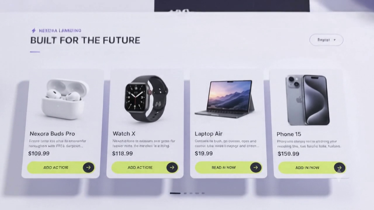
Render, name, price and action are one component. The parent passes a width and nothing else, so the same card fills a four-up row, a two-up grid and a snap track.
tabular-nums holds $19.99 and $159.99 to the same width, so a row of prices lines up instead of drifting.
Every render slot carries an aspect-ratio, so the card is at its final height before the image lands. Layout shift stays at zero.
Motion
A single IntersectionObserver at a 12% threshold adds one class and unobserves. No element is still being watched after it has been seen.
Blocks in a scene arrive one at a time, offset in scroll progress rather than on a timer, so an interrupted scroll never leaves one stranded behind the others.
Every reveal moves 26px on the compositor. Nothing animates height, top or margin, so no reveal costs a layout pass.
Shipping it
That is the full build, from the wordmark to the closing button.
Eight sections share a single fixed canvas. One canvas per scene meant eight contexts and a visible seam at every handoff.
The loader waits on 16 frames and pulls the other 224 in behind them, so the hero is interactive while the later scenes are still filling.
Under prefers-reduced-motion the eased playhead, the focus pull and the stagger drop out. Every scene still shows its copy over a frame.
Six pieces carry the page. Here is the job each one is doing.
 01
A sticky header on a blurred translucent panel: wordmark left, four section links centre, one lime-accented Shop Now pill right. It swaps to a compact solid bar after 40px of scroll so it never fights the hero artwork, and collapses into a sheet menu under 900px.
 02
A floating vertical dock of five icon buttons: home, catalogue, products, support, account. The active item sits in a filled dark circle, the rest reveal their label on hover. It is a real button list, so arrow keys and screen readers both get through it.
 03
A two-column split: 72px display type with EMPOWERS picked out in violet, a four-line promise, and the lime call to action. On the right, four devices float over a violet blob and a dotted grid, each on its own parallax offset so the cluster keeps depth as you move.
 04
The dark inset panel that breaks the light page in half. Four value props, innovative design, powerful performance, seamless connectivity and secure by default, sit between hairline rules under lime line icons. It reflows from four columns to two to one, and the rules drop out with them.
 05
Product cards on a scroll-snap track: render on a tinted plate, then name, price, and a lime arrow button through to the product page. The round prev and next controls drive that same native scroll, so swiping and clicking stay in sync without a slider dependency.
 06
The violet gradient band counts four numbers up, 120+ products, 2.5M+ customers, 98% satisfaction and 24/7 support, the moment it enters the viewport. Below it the closing panel pairs a full-bleed portrait with the pull quote and a bordered card holding the last conversion button.
Wordmark, the violet and lime palette, an 8px spacing scale and a five-step type ramp. Everything downstream reads from those variables.
Buttons, pills, cards, icon docks and bands built in isolation first, each with its own responsive rules before any page existed.
Scroll-linked reveals, the parallax device cluster, count-up numbers, and the 300-frame flythrough driving nine sections of this page.
Frames gated then streamed, motion gated behind prefers-reduced-motion, then deployed and watched on real devices.
I take on product work, landing pages and design systems. Tell me what you are building and I will tell you how I would ship it.
Get in touchNexora delivers more than just gadgets, it delivers experiences. The build matched the pitch on every screen size.